Adventures of a Bad Researcher: The Mystery of the Last Yiddish Linotype
Most visitors to the Yiddish Book Center vividly recall their first impression of the towering stacks of Yiddish books laid out in neat rows from wall to wall, proudly wearing their sunlit titles like badges of honor. Indeed, it is quite a sight—and one that does not wear down. Every morning I’m greeted by these 30,000 Yiddish books, and every morning I’m too overwhelmed to respond, as I should: “Gut-morgn, gut-yor.”
But just as memorable and just as overwhelming is a machine sitting idly on the northern end of the book repository, just beyond the stacks. As I pass through towards my downstairs cubicle, I give it a sidelong glance—a tamed and stern glance—just long enough to make out the sign that sits on it: “Please do not touch the Linotype.”
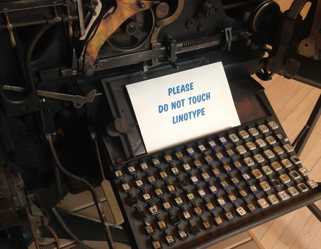
The Linotype is a massive machine. It measures seven feet tall, weighs 4,500 pounds, and flaunts thousands of interconnected pulleys, levers, springs, and gears. And we have just as complicated a relationship. We are on the verge of a falling out. Things are rather tense.
But, of course, it wasn’t always so. It began with infatuation. In September 2017, I started here at the Yiddish Book Center as a fellow. There are four of us, and we rotate giving free public tours of the museum. At first our tours are more or less the same, straying little from the script. But as we grow more comfortable speaking to groups of strangers, more acquainted with the Center, and more knowledgeable of particular Yiddish niches, our tours change, develop distinct flavors, and unique rhythms. Some guides linger in the Applebaum-Driker Theatre because there are simply too many anecdotes about the Yiddish theatre to share. Some guides explore The Vault—officially the Lief D. Rosenblatt Library, our underground storage facility—while explaining the intricacies of cataloging and digitization. And some guides may regale you with Yiddish songs and recount the no less entertaining history of Jewish music publication. But if I happen to be the guide, visitors will find themselves standing around the majestic Linotype—the only surviving Yiddish Linotype—hearing the Center’s official narrative of the machine’s history, the story that sparked my curiosity and my infatuation:
Linotypes and other mechanical typesetting machines were once a common sight in print shops and composing rooms. But by the early 1970s, every major newspaper in America had made the switch from hot-lead to computerized typesetting—except one, the Jewish Daily Forward. Avowedly socialist, the Forverts was unwilling to defy its union. The paper’s typesetters continued to cast molten lead until 1991, when the last union member retired and the paper replaced 18 massive, lead-spewing machines with a single Macintosh computer.
The 4,500-pound Linotype displayed here was in continuous use at the Forverts from 1918 to 1991. Thought to be the last of its kind, it was recovered by the Yiddish Book Center in 1991, occasioning the first (and so far, only) Yiddish headline in the Wall Street Journal.
It’s a wonderful story. I tell it on every tour I give. But it is too wonderful. Suspiciously wonderful. The noble Forverts wielding its undying ideologies, mounting its antiquated, 4,500-pound, lead-spewing Rocinante, stubbornly trotting forward, for the sake of our mame loshn Ducinea, like a Yiddish Don Quixote! I love the story. And it’s because I love the story that I became suspicious of it. I began to tease the Linotype by overemphasizing the charm of its history, making a satire of its past. And from teasing I went to antagonizing it, overtly casting doubt on the facts of the case. And from antagonizing I went to persecuting it, actively researching its story and revealing my findings publicly and to its shame.
To its shame not because my findings are shameful, but to its shame because I have stripped our Yiddish Linotype of its uniform, flowing, well-rounded narrative and given it only disconnected fragments of a memoir. I had hoped to discover its true narrative and more: the history of Forverts’ printing technology, the history of the Hebrew Typographical Union, the history of Yiddish publication software, and more! Instead, I have untied the loose ends and left them looser.
What follows is a story of a personal journey, the adventures of a bad researcher. I hope it successfully opens windows (or at the very least, keyholes) to the Yiddish Linotype, the Yiddish Linotype operator and their workplace, their lingo, and their union. Mostly, I hope it paints a picture of a once material Yiddish world.
The Mysterious Linotype
It is the Linotype’s physical prowess and sophisticated mechanical aspects—and not its Yiddish flare—that first bewitch the defenseless admirer. So it was the Linotype as a machine and technology—and not as a topic in the history of the Yiddish press—that I was first motivated to research.
The Linotype was invented by Ottmar Merganthaler in 1884. It was one of countless inventions of the nineteenth century aimed at improving the efficiency of the slow and labor intensive process of typesetting by hand. Manual typesetting required a large collection of wooden or metal type; each letter, or sort, had to be selected by hand to form each word, line, column, and eventually, page of the paper—if you should run out of a particular sort you would have to take apart previously made-up pages and distribute each sort to their corresponding compartment in large cases of type, all while tearfully exclaiming, “Oy, I’m out of sorts, oy, completely out of sorts...” The longer the newspaper the more type, time and labor it required such that, despite improvements to this process, the production cost for a long paper was rarely offset without impracticable increases in circulation and price of purchase. Thus, though there was no theoretical limit on the number of pages, in practice papers were rarely longer than eight pages a day.
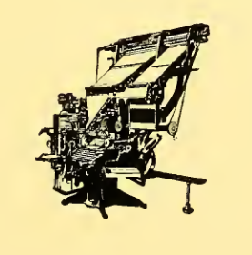
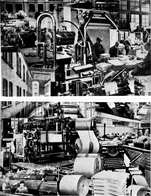
But imagine if sorts could be assembled into lines automatically, with a push of a lever! Imagine that each line could be automatically justified without manual shifting and spacing. And imagine if type could sort itself seamlessly and in seconds. Merganthaler’s hot-metal typesetting machine did all these things and more. As the operator types at the keyboard, molds for each corresponding letter fall into sequence, molten lead is injected into them, the solid line of type is ejected, and the molds recirculate and sort themselves. When a line is no longer needed, it can be re-melted, thereby relieving presses of having to acquire thousands of pounds of type. The Linotype reigned king over all its rivals. (The saddest machine to lose to the Linotype is the Paige Compositor, the machine in which Mark Twain invested and lost the bulk of his fortune.) It allowed for more and cheaper publications. Newspapers could produce longer editions and numerous editions. The Linotype revolutionized printing. And the Jewish Daily Forward, or Forverts, had Yiddish ones.
For those of you who read the Yiddish Book Center’s official narrative above and feel perfectly comfortable with it, allow me to draw my main points of conflict. (1) “...The paper replaced 18 massive, lead-spewing machines with a single Macintosh computer.” Today we are especially aware how quickly technology advances, how quickly large devices become small, how quickly expensive devices become cheap. And indeed, some of these changes are amazing: the first Hell color image scanner was about the size of a large hatchback car and only 20 years later was it shrunk to fit comfortably on a desk. The first magnetic disk drives weighed hundreds of pounds and stored a fraction of the bits now stored on tiny thumb drives. And the first great personal computers are computationally puny compared with today’s smallest smartwatches. But 18 Linotypes to one Macintosh is something else. In cumulative height, this is about 126 feet to one foot, in area about 450 square feet to one, and in weight about 72,000 pounds to 16. Yes, with a computer one need not worry about a “squirt” of molten lead interrupting your workflow, and solid lead lines of type no longer need to be trimmed with saws and hammered into a composition frame called a “chase,” but new technologies come with their own problems: paper copy must be coated with wax, precisely cut with scissors, pasted in proper layout and photographed. And despite the improved efficiency of digital typesetting, human typing speed is still the bottleneck. When the New York Times switched to cold type in 1978 they replaced 140 linotypes—the largest collection in the world—with not 140, but 250 computer terminals. And the Forverts replaced 18 Linotypes with one computer?
And (2), “Avowedly socialist, the Forverts was unwilling to defy its union.” Most newspapers had already switched from hot metal to computerized typesetting by the early 1970s; the New York Typographical Union Local 6 (or “Big Six”), under which most New York Linotype operators were unionized, would certainly have mastered the digital transition by 1991. By the mid-60s the International Typographical Union, the parent union of Local 6, had already made a film promoting the transition from hot metal to cold type and had set up training facilities dedicated to the new process. Union members were trained in the new technologies and guaranteed job security. Well before 1991, a newspaper could have been avowedly socialist, deeply loyal to its union, and still have switched over to cold type without a problem.
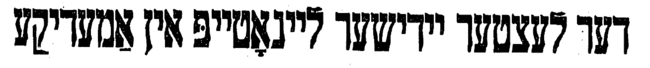
With these two thoughts brewing and developing the characteristics of nascent hypotheses, I pulled up the 1992 Wall Street Journal article mentioned in the Center’s narrative, “Der letster yidisher laynotayp in amerike,” or “The Last Yiddish Linotype in America.” And what do we discover? The article notes: the Forverts had nine Linotypes, a Ludlow machine, a blast furnace, trim saws, six cabinets of type, and “tons of other equipment” that was all replaced by one Macintosh computer; the machine rescued and now residing at the Yiddish Book Center is machine number 23211 and it was built in 1918; and, in 1974 the Forverts moved from its grand ten-story building at 175 East Broadway to the basement of the Workmen’s Circle building on East 33rd Street.
And so, conflict number one has been revised. According to this article, it was not 18 but nine Linotypes that were replaced. All the other equipment and machines should not surprise you—Linotypes were only a segment of a newspaper’s composing room—much more was needed to produce the multi-columned pages paired with photos, advertisements, and headlines of various sizes.
From numerous other articles published between 1972 and 1992 we can agree upon the following general history: Linotype number 23211 is indeed from 1918. It is the Forverts’ oldest Linotype and was, at one point, one of 18. In the 1920s, the paper’s circulation was at its peak, at over 275,000. By 1972, this was down to 65,000–70,000, by 1982 to 38,000, and by 1987 around 20,000. In 1974, the Forverts sold its building at 175 East Broadway and moved to the basement of the Workmen’s Circle building with just eight or nine Linotypes. But by the 1980s there were only three or four Linotype operators to run these machines, about half of them shomre-shabes. These more observant operators were likely not unionized. (It is rumored that one religious Linotype operator would refuse to type Issac Bashevis Singer’s work—who always published his work first in the Forverts—considering it far too lewd.)
There was also less to type: in 1983, the Yiddish paper went from being a daily to a weekly of 32 pages. The number of contributing writers had declined from hundreds to little over 40, none younger than 65, and some as old as 90. (Simon Weber, the editor at the time, quipped sadly, “I think our readers are the same age.”) According to an article in the New York Times, the paper also suffered yearly losses of about $400,000. If we were to somehow uniformly quantify all these changes and graph them, we would be staring at a perfectly steady downward slope: smaller circulation, fewer writers, and fewer editions. By 1991, perhaps four Linotypes were three too many? But the author, for now, neglects everything and notes only the ambiguous state of the union in the Forverts composing room, the mantra-like model number 23211 of the Linotype now housed at the Yiddish Book Center, and the leaving of 175 East Broadway.
The Elusive Composing Room
The 1974 move from the landmark Forverts building to the Workmen’s Circle basement marked a new printing process for the Yiddish paper. Beforehand, in the original building, after typesetting and making up the pages in the composing room on the tenth floor—where lived the Linotypes—they would print the paper on their own presses in the basement.
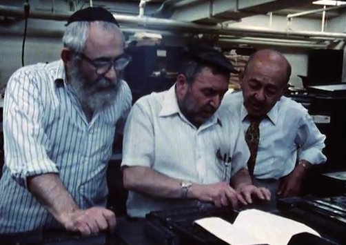
Every description of the Linotype room I have found has portrayed the place as some kind of bustling, clattering, fantastical world full of charismatic, humble, yet all-knowing and all-powerful Linotype operators—and there are many such descriptions. Gus Tyler, who began writing for the Forverts in 1932, recounts his first visit to the “gremlins” of the tenth-floor composing room:
My second day at the Forward I ran to read what I had written...I was impressed: in the paper, my bits came out much better than in the original, both the grammar and the spelling. I rushed to a colleague, “Who does the editing?” I asked. He shrugged. “Ask upstairs in the linotype room. They know everything.”
I found the man who had set my items. “Your handwriting is very neat,” he said. “Here and there I fixed up your spelling a little bit. But don’t worry, comrade, you’ll learn.”
I returned to the ninth floor to ask my colleague whether this is the way things are done at the Forward. “You’re lucky,” he said. “With you, they’re only changing the spelling. With me, if they don’t like what I’m writing, they’re changing my opinions.”
After the move to the Workmen’s Circle building the basement presses were abandoned. Printing was outsourced to a Long Island City printing company. The Forverts had only to compose the page, print a “proof,” photograph it and send it to the printing company.
However, the composing room at the Workmen’s Circle seems to have preserved not just nine Linotypes, but also its old tenth-floor charm. The Yiddish Book Center’s founder, Aaron Lansky, describes its vibe in a 1991 Pakn Treger article published after the Linotype rescue mission. And the most wonderful footage of the Forverts’ compositors and Linotypists can be seen in Marlene Booth and Linda Matchan’s documentary The Forward: From Immigrants to Americans. (In it, the Yiddish linguist Mordkhe Schaechter jokes seriously, “Yiddish has been dying for over 200 years. And we hope it will go on dying for 200 more.”) But all in all, our perception of the Yiddish composing room is anecdotal. We have only vignettes from the viewpoint of those who popped in and were inevitably intrigued; we want to see inside the composing room, where the culture, language and technology were all different.
The Vanished Vernacular
The language in the Yiddish composing room was indeed different. So different that in 1897 Alexander Harkavy published a pocket-sized phrasebook to help Yiddish speakers learn to speak their trade in English. A chapter devoted to the print shop featured phrases like, “Type is made of lead, or of an alloy of copper and zinc,” first presented in Yiddish, then in English spelled out phonetically with Yiddish characters, and finally in English using the English alphabet.
But non-technical language—language not necessary to get the job done—draws a better picture of the composing room dynamics. For example, the linguistic differentiation between the two kinds of typesetter, or “shriftzetser.” A shriftzetser with knowledge of the entire printing process would be called a “maynster zetser,” an omnipotent craftsman who not only understands the ins and outs of his profession, but will fix one’s spelling, grammar, and in the case above, opinions. On the other hand, a shriftzetser who knows only how to “chop” lines would be called a “holtsheker,” or woodchopper. To succeed he needs only “ledernem hintn,” a leather behind, because he does nothing but sit, chopping away at his machine. But should a holtsheker get it into his head that he, too, can act as his more capable colleagues and make corrections, to all others his “corrections” will likely appear as horrific orthographical mistakes. In that case he is mockingly dubbed, “habokher hazetser,” because he is a young, naive, and aspiring learner like his more traditional counterpart: the unmarried adolescent yeshiva “bokher.” Simon Weber, editor of the Forverts until its ninetieth anniversary in 1987, recalls such a habokher hazetser:
Some typographers were good and some were idiots. One who was an idiot would come to me with the word “conference” and he would say, “It’s too long. It won’t fit. Can I take out the c?” I’d say. “No, the c has to stay but you can take out the n or the f.” Once he came to the city editor with a headline about something that happened in Yekaterinoslav [Ukraine]. “It’s too long,’’ he said. “OK,” the city editor said, “make it Kiev.”
From just three Yiddish expressions used in the composing room we gain an understanding of a three-tier hierarchy of typesetters, of the skills valued as typesetter, and of the respect due typesetters of each tier. These characterizations were surely embodied at the Forverts—by the very Linotype operators described above—but was the language itself in use? And if yes, when did this become an obsolete vernacular?
But let us return to our Linotype, #23211. I sat a whole day chanting, “23211, 23211, 23211...” And behold the results: machine number 23211 is a model 18 Linotype, which was introduced in 1916. It has a capacity of two magazines. A magazine is a collection of matrices, or mats. Mats are molds, each representing one character. As you type, the corresponding mats fall into the assembler—where you can make last-minute changes before you pull a lever to have them casted—and molten lead is injected into them, forming a slug, or a solid line of type. The mats then automatically circulate the machine and sort themselves and the slug is neatly ejected. A machine with two magazines means a machine with two typefaces. Model 18’s magazines are interchangeable with magazines used on model 4, 5, 6, 7, 8, 14, and 19. The earliest of these machines, model 4, was introduced in 1906. But, nu, who cares?
I mention these dates and model numbers only because they offer a thrillingly technical insight into the vibrant Yiddish press of the twentieth century, and the material history of Yiddish. While we often hear of countless Yiddish newspapers and journals, their editors and their writers, we seldom hear of the fonts and typefaces they used and knew so well. Type cases were labeled by font, compositors had letterforms impressed in their memory, and Linotype operators could identify fonts by their Linotype “triangle number” marked on the side of matrices.
But what if the existing Linotype typefaces were not satisfactory? Matrices were manufactured by the Linotype company. Thus, if you needed a new specialized font you hired your own typographers to design it, sent drawings of the typeface to the Linotype company, where they made their own drawings and produced matrices from them. Yiddish matrices were in fact upside-down relative to Latin typeface matrices, thus enabling right-to-left composition without modifying the machine itself.
Frank Romano, Professor Emeritus at Rochester Institute of Technology, has kindly provided me with a complete list of Linotype fonts, drawings of which are held at the Museum of Printing in Haverhill, Massachusetts. Linotype produced 30 Hebrew fonts, only two specifically for the Forverts, both in the same year, 1923. Three fonts were produced before 1906, making them incompatible with machine #23211, the Forverts’ oldest machine. Seven were made for Jewish Press Publishing Company. One was made for the Jewish Morning Journal. And six were made for the American Type Founders, a consolidation of 23 foundries formed in 1892, largely in response to the advent of hot metal typesetting and the invention of the Linotype in 1884. In short, the many Hebrew Linotype fonts produced by the Linotype company were surely intended for the many Hebrew and Yiddish Linotypes that were around. Though this fact in and of itself is not surprising, it reveals just another bustling and busy scene in the play that is the Yiddish press. Linotype #23211 may be the last Yiddish Linotype, but it is the last of many Yiddish Linotypes that were once in use in hundreds of print shops around the world.
Algemeiner Journal, a latecomer to the Yiddish newspaper industry read and produced mainly by Lubavitch Hasidim, was established in 1972 with three or four Linotype machines. The paper smoothly transitioned to cold type in the 1980s, investing in three AM Varityper machines, which sold for about $2,000 each. The Forverts actually intended to make the switchover in partnership with Algemeiner, but bailed in the end, deciding not to leave its offices at East 33rd Street. Because the AM Varitypers machines had to be physically shared, unlike today’s “cloud computing,” the joint investment presumably required relocating to a new shared workspace.
The obscurity of this event and the circumstances surrounding it are especially bothersome. It addresses everything we are interested in but asserts nothing: did the Forverts indeed bail because it did not want to move its offices? Or was it because of a union problem that did not apply to the potentially non-union Algemeiner? But then could it have been a money issue? Or perhaps the transition was simply too great a project to embark on at the time?
The AM Varityper, the machine Algemeiner adopted, was a phototypesetting machine—a completely new process of typesetting. As you typed on the keyboard, the corresponding digital characters would appear in green on a black computer screen mounted to what looked like a clunky office desk, but which in fact housed the computing power and digital memory. The type was projected onto photographic film, which was processed and finally printed off-site. But how did it deal with a right-to-left script like Yiddish? According to Algemeiner Journal, they dealt well and were not—as I had suspected—cumbersome at all. Algemeiner has, however, long since abandoned the AM Varityper. They currently type their Yiddish content in Microsoft Word and send the file to another staff member who designs the layout in Adobe InDesign.
A Union, a Bobe-Mayse
We have looked at the Linotype, visited the composing room, and learned the lingo; now we turn to the union. Perhaps there are archives that conceal secret answers in inconspicuous folders marked “miscellaneous financial records” or “local offices 1929–1969” or “scrapbooks 1931–1979.” The union might have kept records of Linotype operators assigned to certain shops, allowing us to deduce from the number of Linotype operators just how many Linotypes there were. Or we might compare the negotiated wages in union contracts of a certain year with the corresponding composing room costs recorded by the Forverts, giving us a rough estimate of the number of people employed in the composing room.
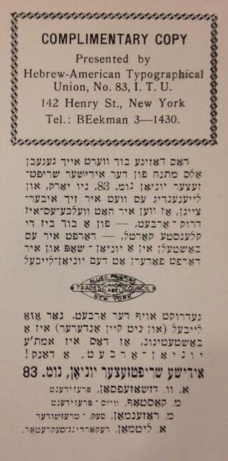
Az me zukht gefint men: three are indeed three collections, two at the YIVO archives in New York and one at the New York Public Library, each gleaming with youthful hope. But after rummaging through the archives of the Forward Association 1913–1972 and 1986–1987, the Hebrew-American Typographical Union 1888–1961, and the New York Typographical Union No. 6., 1829–1988 we remain no closer to answering our questions about the Yiddish Linotype. Instead we momentarily put aside the machine and the worker’s relationship with it, to focus on the Forward Association and its relationship with the worker.
Yes, the Forward Association was a socialist organization and an ardent supporter of the Socialist Party and, later, the American Labor Party, but how did it interact with the Hebrew-American Typographical Union, the New York Typographical Union, the International Typographical Union, the union members themselves, and the union applicants? What does a new work contract for its compositors say about the organization’s values? What do miscellaneous newspaper clippings someone at the Forward felt inclined to preserve say about the institution? And what does a twenty-pound tome filled with the names of thousands of union members evoke about a union so strong and so proud that it prohibited non-union members from even touching type?
The materials found in these archives offered not historical or technical information, but emotional and sentimental insight. Take this July 18, 1955 letter addressed to Mr. James P. Redmond of New York Typographical Union Local 6 from Hyman Bloom, President of the Hebrew-American Typographical Union Local 83:
Dear Mr. Redmond,
Last week I was called down to the editorial department of the Jewish Daily Forward, where I am employed, and my attention was called to a sobbing woman telling the labor editor that her son, Max Greenblatt, was among a group of compositors called out on strike by Typographical Union # 6 at the Shneider Press over a year ago. She claimed that the strike was lost and that her son, who was the only supporter of the family, could not get any work since then.
It is customary with readers of the “Forward” to come with their troubles to their newspaper, and the labor editor asked me if I were able to do something to help that reader, through union No. 6. I promised him to get in touch with you and inquire if you could do anything to place him somewhere as an apprentice or to help him in some other way. I will be very much pleased to hear from you at your earliest convenience.
Fraternally yours,
Hyman Bloom, President
What kind of Utopian socialist paper is this? Not only does it take responsibility for its own employees, but it stands up for the former employee of an unrelated press only because the poor worker’s mother reads the Forverts! But this is not the only picture we get. Sometimes the Forward was not always so perfectly altruistic. In 1941, Local 6 contacted the Hebrew-American Typographical Union with a complaint:
I am writing at this time to advise that information has been given to me to the effect that working conditions and wages for our machinist-members at the Jewish Daily Forward are not as favorable as those enjoyed by the printer-members of No. 83. If this is true, may I count on your cooperation to have the matter straightened out to the mutual satisfaction of all concerned?
Local 83 responded promptly the very next day:
As soon as I received your letter of the 14th, I immediately contacted the Chairman and the Secretary of the Jewish Daily Forward Composing Room, and they assured me that the machinist-members from No. 6 are enjoying the same working conditions and wages as the members of our Union do, that is, six working hours (including 1/2 hour for lunch) and 12 dollars per day, also two weeks’ vacation with full pay.
But despite the assurance of the Hebrew-American Typographical Union, the Big Six was not satisfied. Four months later, they requested an in-person meeting to discuss the “Jewish Daily situation.” Whatever the situation was, it seems to have dissolved. In any case, no other records were kept by Local 83.
What is the difference between Local 83 and Local 6 of the International Typographical Union? Local 83 was the Hebrew-American Typographical Union, founded in 1888 and incorporated in 1891. Sometimes it was referred to as the Yiddish Typographical Union, or the Yiddish Typesetter Union, as it is in the union’s own publication, Fuftsik yor yidishe shriftzetser yunyon (Fifty Years of the Yiddish Typesetter Union). But it differed more than just in name. Linotypes were not the safest machines. While running the machine you risk experiencing a “squirt” of molten lead that escapes the cavities of the matrices. The pressure at which it is ejected and the aperture through which it squirts can easily enable the liquid metal to reach the far side of the composing room.
(In fact, the Museum of Printing experienced such a squirt just a week before my visit, rendering their Linotype temporarily inoperable. The not-quite-retired lifelong Linotypist who was assisting with the repairs was only too excited to run across the room to point out the lead that scarred the wall opposite the machine. Surprised, I even asked, “It went across the whole room?” He pridefully confirmed.)
Or if you happen to be repairing the machine, God forbid you forget to turn it off! The whole day you are massaging poisonous lead into your hands. And you can rely on the heavenly chorus of sounds that these machines make, rhythmically working to deafen you—so much so that larger composing rooms generally sought to hire already deaf workers to avoid the hassle of going through it on the job. Even at the Forverts a Linotype operator had to sign a formal waiver: “I, the undersigned, [name], of [address], release herewith the Jewish Daily Forward of all responsibility in case of an accident while I am practicing on the Linotype machine on its premises.”
Because of these dangers and because of their high standard of quality, unions admitted only assuredly skilled workers. To be admitted, you had to pass a test, and to pass the test you had to be trained, either at the International Typographical Union facilities or the Linotype Company school. However, to gain admittance to the Yiddish Typographical Union you had to prove adept not only in English typesetting and comprehension, but Yiddish too. After passing a test in English composition administered by Local 6, Local 83 would then test your Yiddish composition. It seems Local 6 had once requested that Local 83 offer one Ben Smith, presumably a Yiddish speaker, a test in Yiddish composition without first proving proficiency in English composition. Local 83 responded skeptically, “It would be unfair for us to give him a test in Jewish only and recommend his admittance in your Union which is solely an English language local.” Ben Smith was ultimately tested in English composition by Local 6, but it was a lost cause: they sadly informed Yiddish Typographical Union that “Mr. Smith is not competent. He is fair in composition and very poor in English.”
The only labor dispute of press-worthy dimensions memorialized within these archives began around mid-January of 1951 and lasted until the end of the month. A handful of sepia newspaper clippings give us the story: the Forward has been losing money for four or five years, with a circulation of 75–80,000; on January 19, the Forward announces it will suspend publication on February 8, unless the dispute over pay is settled: ten percent reduction for 120 employees represented by the Yiddish Writers Union, the New York Newspaper Guild, and the Hebrew-American Typographical Union (HTU). Hyman Stein of the HTU responds confidently, “They asked us to cut the number of compositors from 42 to 34. I believe it will be straightened out at our meeting on Tuesday”; and on January 31 a negotiation is reached: there will be a fifteen percent reduction of 250 employees, and a “tightening” of overtime, operating losses will continue, and the deficit will be met with the reserve from when the paper was doing well with a circulation of 200,000. Compared with the hullabaloo between newspapers and unions at the time—the first line of a 1967 book on the subject reads, “In the last four years New York City’s newspapers were shut down by strike or lockout for nearly 300 days”—this Forward dispute is extraordinarily minor. The Forward, though ultimately abandoning its socialist slogans for decades printed on its masthead (“Worker from all the lands, unite!” and “Liberation of the worker depends on the worker itself!”), seems to have remained devout to its values of social justice and equality.
When I asked Frank Romano, an expert on the printing industry, whether he thought it likely that the Forverts refrained from switching over to cold type because it would not defy its union, though its three or four Linotype operators may not have been unionized, though all other unionized papers switched over long ago, though the Hebrew-American Typographical Union had already dissolved into the New York Typographical Union, and though their parent union, the International Typographical Union already dissolved into the Communications Workers of America, he said assuredly, “It’s just as good a reason as any.”

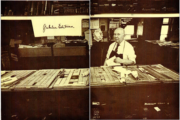
Spare parts for the Linotype from the Forverts–someone was able to sift through these parts, labeled only by part number, with relative ease.

Matrices from the Forverts stored in cigar boxes, resting on an open draw of a type case, also from the Forverts.

Wooden type used for pagination.

A composing stick filled with metal type making up the word shabes.

An empty composing stick on a bed of wooden reglets, used for spacing lines of type.

Linotype matrices scattered over a book of Linotype fonts.

Halftone photo plates featuring prominent Yiddish writers, with penciled labels.

An ink roller and a large letter fey against a page of the Forverts.

A type case with font sizes labeled.

Assorted metal type.

Bad page composition by the author incorporating Linotype slugs, Ludlow slugs, furniture, and quoins. The line in blue was printed with a Yiddish Linotype slug found in the vault and with some grammatical corrections means, "The Yiddish printing machine remains."

A Linotype magazine marked, "6pt Hebrew."

A Forverts oil can triumphant over disintergrating newsprint.
Lead and Yiddish: A Shidekh
It is tempting to conclude this chapter of our adventures as Sholem Aleichem elegantly concluded his story “Yom Kippur Scandal”: by completely neglecting the original matter of interest. But as a bad researcher with some dignity, I must put forth the still loose ends: we have not discovered why the Forverts waited until 1991 to switch to cold type, nor the union status of the last Forverts employees, nor who designed the typesetting software installed on the one (or several) Macintosh computer(s). But we have painted a picture—albeit with crayons and having colored outside the lines—of the Yiddish composing room of a great Yiddish paper. We have gained enough insight to imagine the hustle and bustle of the physically and technically demanding Yiddish workspace. But if, like Sholem Aleichem’s hero, I am to be found guilty of something, it will not be of stealing 800 rubles, or of eating chicken and plums on the holy fast day of Yom Kippur, but of romanticizing the Yiddish Linotype and its time and place. And maybe romanticization of the Yiddish Linotype is just what we need.
I am certainly not the only one infatuated with the Yiddish Linotype. The Yiddish Book Center felt the need to rescue one, when most forgot plainly about their existence. A small press in Massachusetts modified a Linotype they had to print Yiddish. A press in Israel cared enough to purchase it and arrange for the challenging and expensive task of shipping it across seas. Many have felt compelled to publish their recollections of the Yiddish composing room. To further amplify their plan to eradicate Yiddish culture in the Soviet Union, in 1952 the KGB smashed Yiddish Linotype machines to pieces. The Yiddish printing terms scattered throughout this piece derive from a couple articles on Yiddish publishing terminology, in a prominent Yiddish linguistic journal. The Yiddish Linotype gets attention. And while other Linotypes have been given funerals, machine number 23211 still stands strong, still in a building devoted uniquely to Yiddish, and still getting attention.
Yiddish has very little physicality today, very little of the tangibility that intrinsically fosters love. Yiddish is not palpable. When Aaron Lansky embarked to save the Last Yiddish Linotype and was in dire need of funding for the rescue, he asked members for $50 and promised as an incentive their name, in Yiddish, in solid lead: a literal line-of-type. One thousand members responded. Perhaps some wanted to save a historical artifact; but many undoubtedly recognized the beauty in Yiddish materiality. The Yiddish line-of-type was the heart of a tangible Yiddish culture and literature that is extinct today. It is gone, along with Yiddish sign makers, Yiddish street vendors, Yiddish cobblers, and Yiddish tailors. Of course we still have Yiddish books. We appreciate the physical book and we pick it up, we feel it, we smell it, we may even read it. But we don’t pick up a book and make something new with it—it is not a tool of creation. A special physicality of the Yiddish language is gone: the hot-metal in Yiddish molds, the columns or shpaltn of Yiddish set in iron frames, the laying of ink or drukerfarb over Yiddish pages, the technical training needed for a Yiddish job, the labor disputes and processes unique to a Yiddish union. These are the physical means of production that lent life and vibrancy to the Yiddish slug, the Yiddish word, the Yiddish union, the Yiddish paper, and the Yiddish reader.
The Yiddish Linotype is, on the one hand, a relic of a world that is no more, but it is also, on the other hand, a living 4,500 pound reminder that Yiddish had a vital and tremendous creative physical output. Today’s Yiddish reader and creator is in the digital age. Here, Yiddish, of all things, has a tremendous, even disproportionate, presence. Top universities and organizations around the world trailblaze the young field of digital humanities with Yiddish projects. In the past few years we have seen the birth and flourishing of dozens of digital Yiddish initiatives: In Geveb, the Digital Yiddish Theater Project, AHEYM, EYDES, and the Yiddish Corpus, to name just a few. The Historical Jewish Press project is digitizing nearly 60 Yiddish periodicals. And here at the Yiddish Book Center we have digitized almost 12,000 books, 800 Yiddish related audio recordings, and produced over 800 oral history interviews—all instantly available through the Web from any computer. These undertakings are invaluable and are fueling what seems to be unanimously understood as a Yiddish revival.
But there will always be something elusive about a culture that can be turned off with a power button. That is why Yiddish students get a kick out of a trip to Williamsburg, Brooklyn, where they witness—perhaps for the first time—Yiddish objects: Yiddish signs, Yiddish fliers, Yiddish vending machines, Yiddish candy wrappers, Yiddish toothpaste, Yiddish games, Yiddish school buses. The physical is so deeply absent in Yiddish that it takes only a soda can with a Yiddish label to blow us away. Without the physical, our Yiddish experience is incomplete and lacking and our creativity is capped. Without the physical Yiddish becomes a relic; it is printed, bound and placed on the shelf; it is disarmed, disarmoured and laid to bed.
This is why, greeted every morning by thirty thousand Yiddish books, I am also too overwhelmed to respond, as I should: “gut-morgn, gut-yor.” But it is also why things are tense between me and Linotype #23211. To me the Linotype is no longer an artifact, a relic of a world that is no more, but a call to action. The Linotype wants to be saddled and together with its knights-errant fight glorious battles against horrifying giants. It wants Yiddish to stain clean pants with black ink. It wants Yiddish to take up space and lie on the floor. It wants Yiddish to callous hands. It wants Yiddish to have us break a sweat. It wants Yiddish to create physically again. The Yiddish Linotype, above all, hopes it is not a relic that represents a world that is no more, but a world that is yet to come.
—Raphael Halff
Some relevant books from our collection:
- Fuftsik yor yidishe shriftzetser yunyon (Fifty Years of the Yiddish Typesetter Union)
- Yidishe tipografye un bukh oysarbetung kunst (Jewish Typography and Bookmaking Art)
- Fuftsik yor lebn: meyer kastof, der bokher hazetser (Fifty Years of life: Meir Kastof, the Bokher Hazetser)
- Yoyvl bukh fun profesioneler fareyn fun druker arbeter in vilne (Jubilee Book of the Professional Union of Print Shop Workers in Vilna)
- 50 yor "forverts" (50 Years of the Forward)
- Don Kikhot (Don Quixote)
The YIVO Institute for Jewish Research archives referenced: